Case Study: Shoreline Burgers
Fictional Burger Joint Brand Concept
Project Snapshot
Project: Shoreline Burgers — fictional burger restaurant
Location: Long Island, NY (concept)
Tools: ChatGPT (AI), Adobe Illustrator, Adobe Photoshop
Overview
Shoreline Burgers is an imaginary burger joint created to test how A.I. could help shape a brand concept and identity from scratch. A.I. was used for brainstorming names, taglines, and angles; all of the visual work—logo, color, typography, pattern, packaging, business cards, poster, and storefront mockup—was designed by James in Adobe Illustrator and Photoshop.
The goal was to build a brand that feels like a fun, slightly retro burger spot you’d find near the Long Island shoreline: bright, casual, and memorable.
Concept Development
Using ChatGPT early in the process, I explored:
Different name directions tied to Long Island and the coast
Taglines and positioning ideas for a shore-themed burger joint
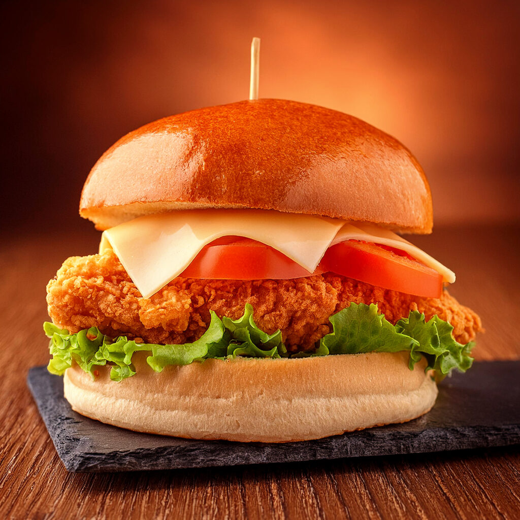
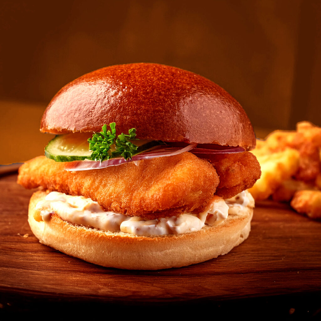
Menu and product ideas (lobster burger, chicken sandwich, breakfast burger, fish sandwich) to use in visuals
Visual themes like surf, sunset colors, stars, and simple line-art burgers
From this exploration, I locked in the name “Shoreline Burgers” and the tagline “Fresh Off the Grill, Straight from the Shore” as the foundation of the concept.
Design Execution
Once the concept was defined, I moved into Illustrator and Photoshop to build the brand system and applications.
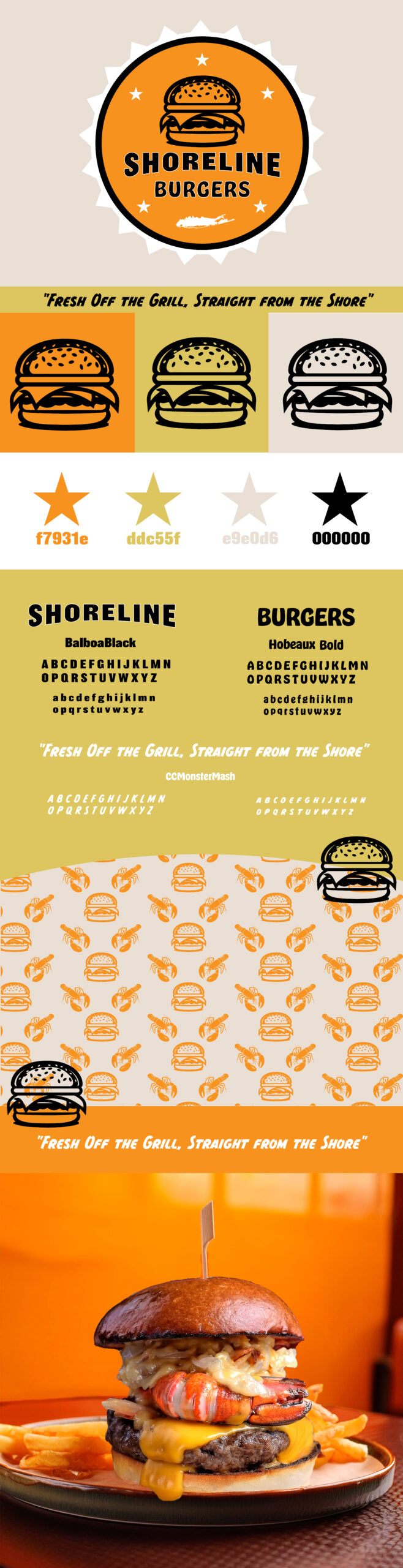
Logo and Identity System
Designed a primary circular badge logo with a line-art burger at the center, surrounded by stars and a small Long Island silhouette.
Created alternate logo layouts for horizontal use and simplified marks.
Built a warm, high-impact color palette:
Orange (#f7931e)
Mustard yellow (#ddc55f)
Soft beige (#e9e0d6)
Black (#000000)
Chose Balboa Black for “SHORELINE” and Hobeaux Bold for “BURGERS” to get a bold, slightly vintage diner feel.
These elements were pulled together into a brand board showing logo options, color swatches, and typography.
Brand Assets and Pattern
Developed a repeat pattern featuring burgers, lobsters, and fries in the brand colors for use on packaging and backgrounds.
Refined the pattern so it works both as a hero texture and in smaller applications like cup designs and box wraps.
Branded Applications
To make Shoreline Burgers feel like a fully realized restaurant, I extended the identity across multiple touchpoints:
Packaging system mockups: takeout bag, burger box, fry container, drink cup, stickers, and burger flag, all using the badge logo and pattern.
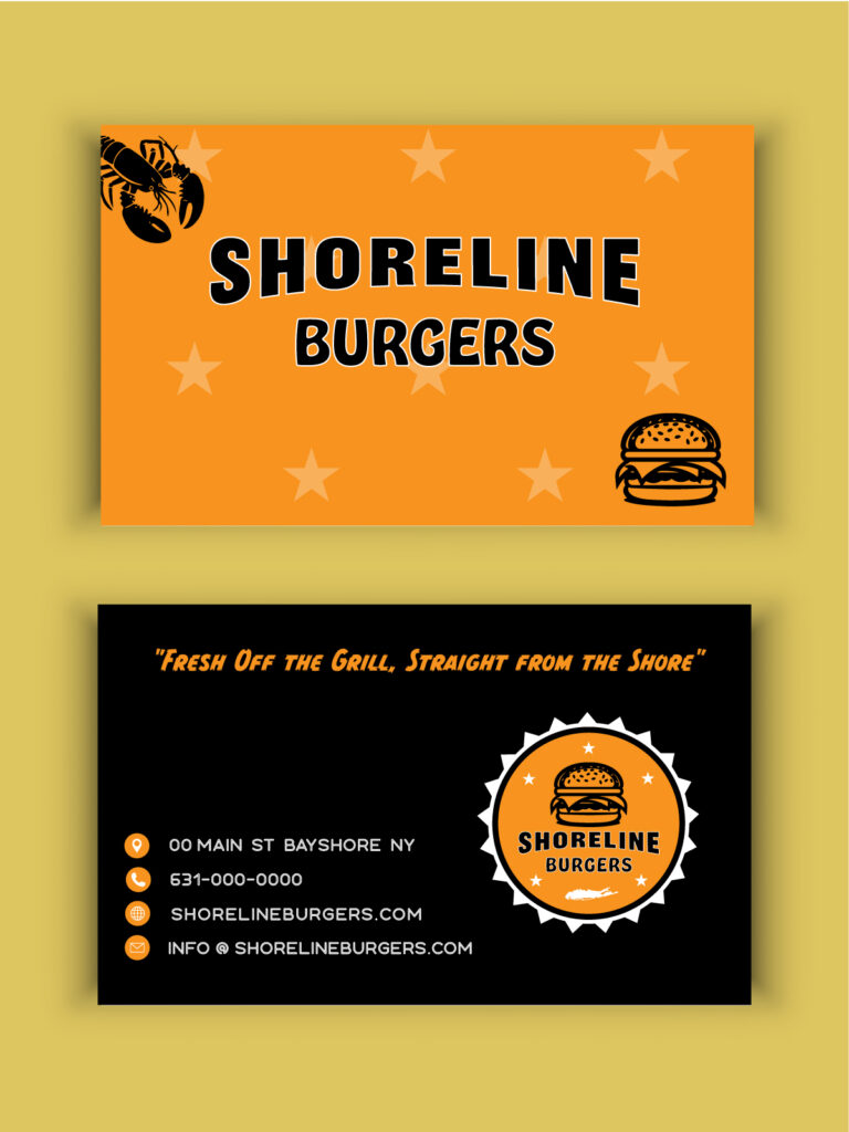
Business card design with the Shoreline Burgers wordmark, tagline, and contact details.
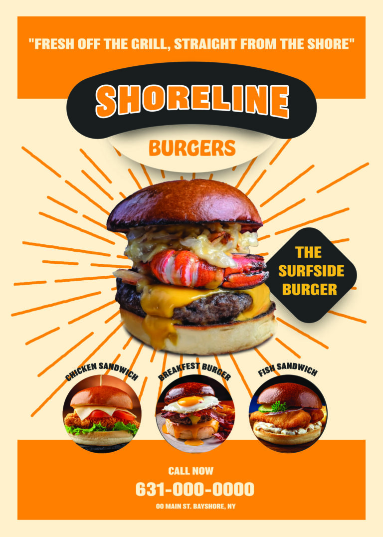
Poster/menu-style hero piece featuring “The Surfside Burger” and supporting items, using radiating lines and bold type.
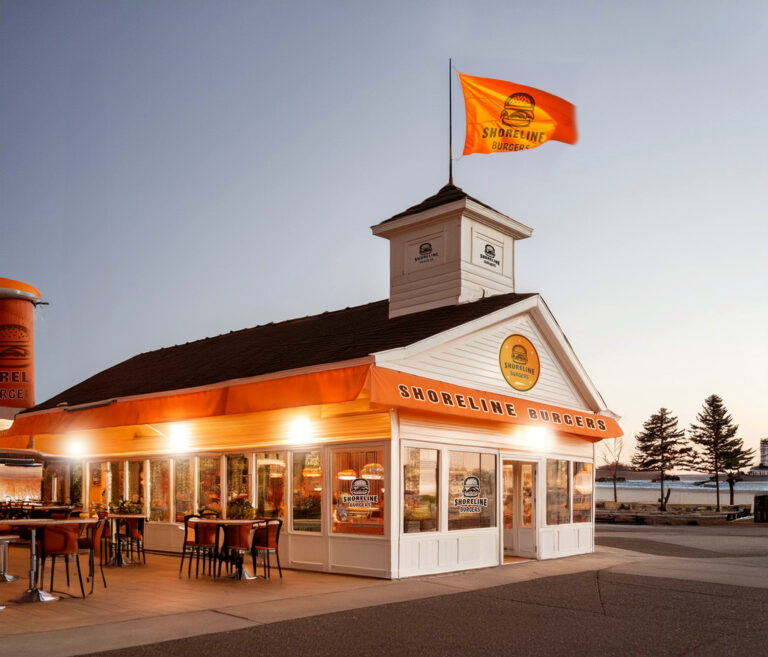
Exterior restaurant mockup with Shoreline Burgers signage, awning, and flag in the brand colors to show how the concept would look in a real setting.
Food Imagery
I used Adobe Firefly to generate burger and sandwich photography, then adjusted and retouched the images in Photoshop so they matched the brand’s warm, saturated color feel and worked cleanly in the poster and packaging layouts.
Final Deliverables
Shoreline Burgers logo set (primary badge and alternates)
Color palette and typography choices
Burger and lobster icon graphics
Repeat brand pattern
Packaging mockups (bag, box, fry container, drink cup, stickers, flags)
Business card design
“Surfside Burger” hero poster
Exterior restaurant mockup
Takeaways
Shoreline Burgers shows how A.I. can be used at the front of the process to shape names, taglines, and overall direction, while the final identity is still built through hands-on design work. A.I. helped speed up brainstorming and concept framing; I used Illustrator and Photoshop to develop a full, consistent visual system that makes the fictional restaurant feel ready for the real world.