DEVILLE ENTERPRISES
DEVILLE ENTERPRISES
Brand Identity, Business Card & Event Flyers
Client Background
Deville Enterprises is an insurance and professional services business based on Long Island, NY. The owner wanted a more polished, professional presence for her growing book of clients and gave me full creative control over the branding, with one non-negotiable: the brand needed to live in the blue family.
Project Scope
Develop a new logo and visual identity
Create a memorable tagline
Establish colors and typography
Design a business card
Apply the branding to a series of congratulatory/event flyers
My Role
Brand + logo designer
Tagline development
Print collateral + layout design
Production of print-ready files
Concept & Direction
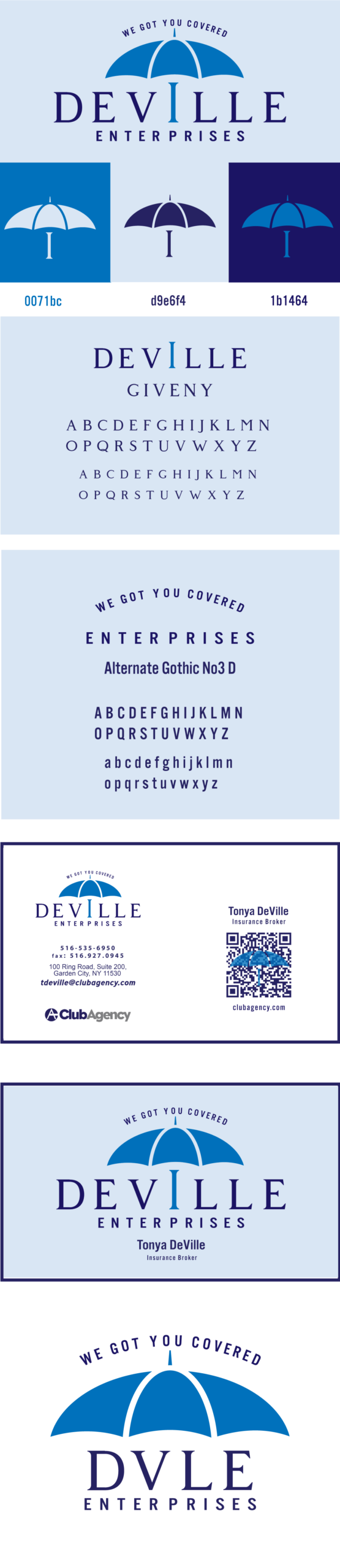
Tagline & Symbol
With the business centered around insurance and protection, I developed the tagline:
“WE GOT YOU COVERED”
From there, I created the umbrella as the central symbol—an immediate visual cue for safety, coverage, and peace of mind.
Logo Exploration
I presented five different logo concepts exploring variations of the umbrella, wordmark, and hierarchy. The client fell in love with one direction immediately: the umbrella paired with a refined serif wordmark and supporting sans-serif typography.
Final Identity
Logo System
Primary logo: umbrella icon with “DEVILLE ENTERPRISES” wordmark and tagline arched above in select uses
Alternate lockup: compact “DVLE” + umbrella for tighter spaces and secondary applications
Color Palette
Working within her request for blues, I built a flexible set of tones:
Bright blue for the umbrella
Soft light blue background for friendly, approachable layouts
Deep navy for typography and contrast
Typography
Giventy for the DEVILLE wordmark—elegant and established
Alternate Gothic No3 D for “ENTERPRISES,” the tagline, and secondary text—condensed, modern, and highly legible
Business Card Design
I translated the identity into a clean, professional business card featuring:
The primary Deville logo and tagline
Clear hierarchy for name, title, and contact details
Optional QR code linking to her online presence
Consistent use of the blue palette and type system for a cohesive look
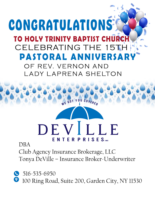
Event & Congratulatory Flyers
To extend the brand into real-world applications, I designed several flyers and congratulatory ads using the Deville identity, including:
Anniversary ad for a local mothers’ club
Pastoral anniversary flyer for a church
Additional community recognition pieces
Each design keeps the umbrella mark, tagline, and contact details consistent while allowing headlines, decorative elements (like balloons or rain motifs), and layout to flex for each event.
Deliverables
Primary and alternate logo files
Tagline and basic brand specs (color + type)
Print-ready business card (front and back)
Print-ready event and congratulatory flyers
Summary
For Deville Enterprises, I developed a complete, umbrella-centered brand identity from the ground up—tagline, logo, color, type, business cards, and event flyers. The result is a cohesive, recognizable look that clearly communicates coverage, trust, and professionalism everywhere the brand shows up.